IDMF vs IDMf
The correct choice is clear. I feel dirty even typing “IDMF.”
IDMF vs IDMf
The correct choice is clear. I feel dirty even typing “IDMF.”
Hey guys - something I said lol
Whatever…it’s all good…I’m just really freaking happy the forum got back up…
I was just wondering when the ‘Post your own material’ sort of room will be available…
Come on you people…
will IDMf artist tags ever make a return? I see mods have a symbol, of sorts. Maybe something for artists, and/or donators to have flair, if donations make a return.
I rather liked my artist tag, made me feel worthy in life ![]()
I just had a pretty easy idea: Put a link to the bandcamp with all the releases on it and sticky it somewhere. That’s an easy victory!
The listening booth is up, what else are you looking for?
I just don’t know if I should post my personal music productions in that.
I thought it is just for mixes and stuff.
Yeah I miss the artists tags. They are sort of funny and inspiring.
@TaleTwist, dunno if you noticed, but Member Releases is back now.
Yo @relic thanks for the attention. I will share my releases.
Cheers.
my man <3
i miss [you]
Honestly I think the site could due with an upgrade to the color scheme. The orange and gray is SO tiresome.
While the site was down, and access was blocked behind a login window, I was really kinda excited about the black header bar. The old site felt so stagnant, with so many key people gone. The color theme feels like it carries that on.
I mean, it’s IDMf, but must we always show the same face?
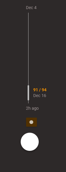
The logo when you scroll down in a thread is black on black, and as such is not visible.

Inverted, it looks cool.

But, this looks better:

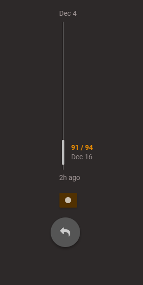
Also, the reply button in the sidebar has a white icon on a white background.
With a nice medium grey background, it looks good:
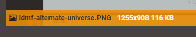
Also, IDMF from an alternate reality looks cool:
Edit:
One more, the informational banner that appears on hover of an uploaded image has grey text of a similar contrast to the background, making it hard to read:
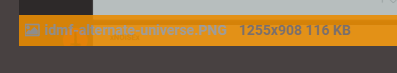
With a change of color, all is well:
i had no idea there was an icon in that circle ![]()
i assumed it represented the box you type in ![]()
That’d be terrible UI design haha. And considering the makers of Discourse know what they are doing, one can deduce that any such instances of bad design are not the doing of the software vendor, but instead, the consumer.
@admins: No offence guys, you’re doing a great job! ![]()
Edit: that’s cool, if you use @, followed by the name of a user role, you can target all of that group!
It’s the little things that shine through.
I just have to say, browsing the forum on the new discourse architecture on mobile is fuckin slick. Really works nice.
I said it in another feedback thread, but I’ll mention it here as well–anything that requires us to edit the code of the forum isn’t going to happen until we get a trusted web person on the team. If we can’t change it through the admin tools, it isn’t going to happen. Just an FYI.
@relic, I may not be trusted, but the below is only CSS. It is not even a programming language, it is declarative and only capable of changing the look of elements on the page.
The below CSS will style the round reply button and the orange strip containing file name and image dimensions when you hover over it, as per my screenshots:
.widget-button.btn.create {
    background: #444;
}

.meta .filename {
    color: #222;
}

.meta .informations {
    color: #FFF;
}
As for the logo when you scroll down in a thread, one would assume that would be editable as an option in the back end. Though perhaps it was intended as both a logo, a stylistic metaphor by the developers.