I can try some mild variations of the first one and pair it to some of those, just to see what else comes out of it.
Also, if anyone’s smitten by any of mine that don’t get selected, I’d love to recycle and repurpose them for members’ singles, EPs, albums, or whatever. I’m saving project files (kind of a rarity for me) so everything should be adaptable
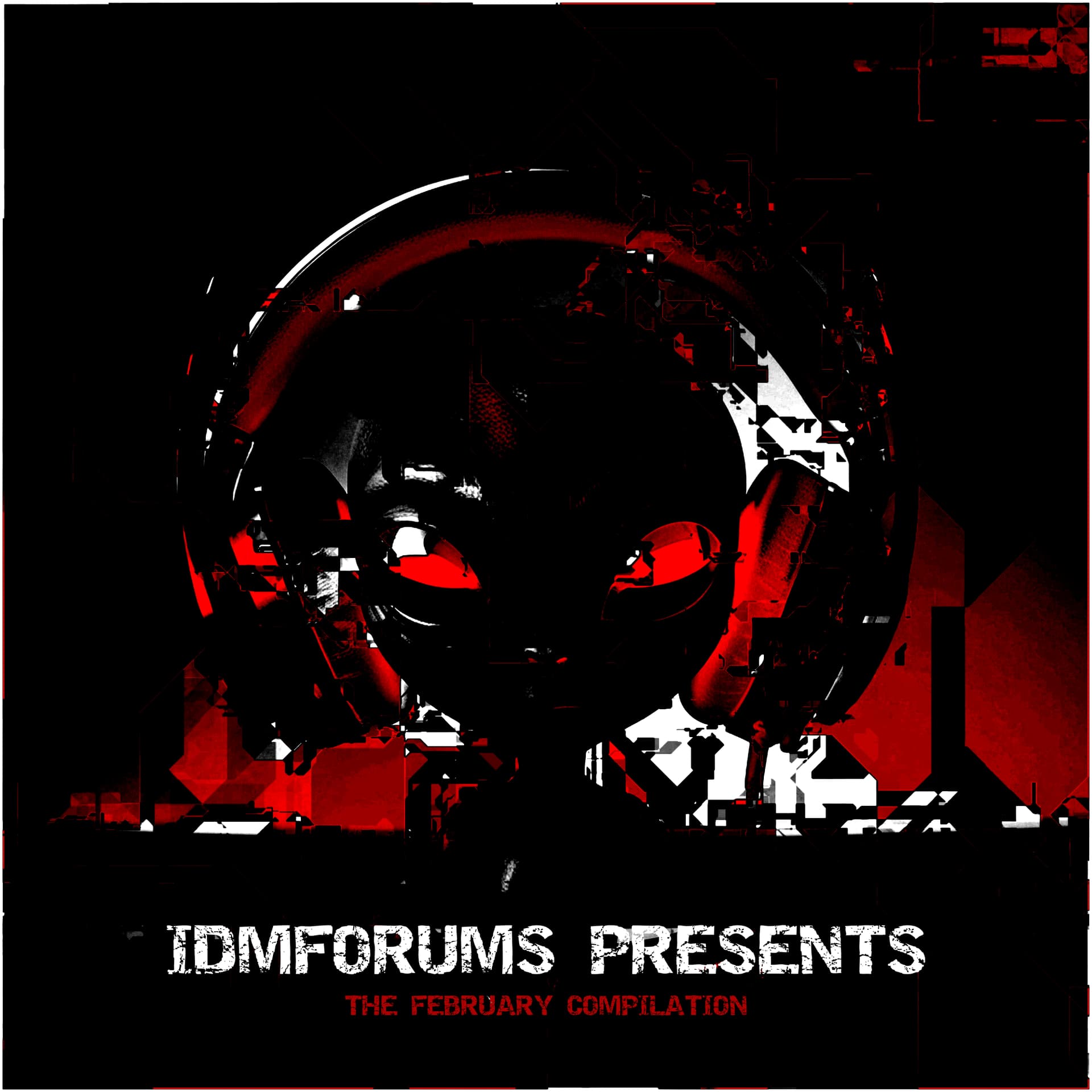
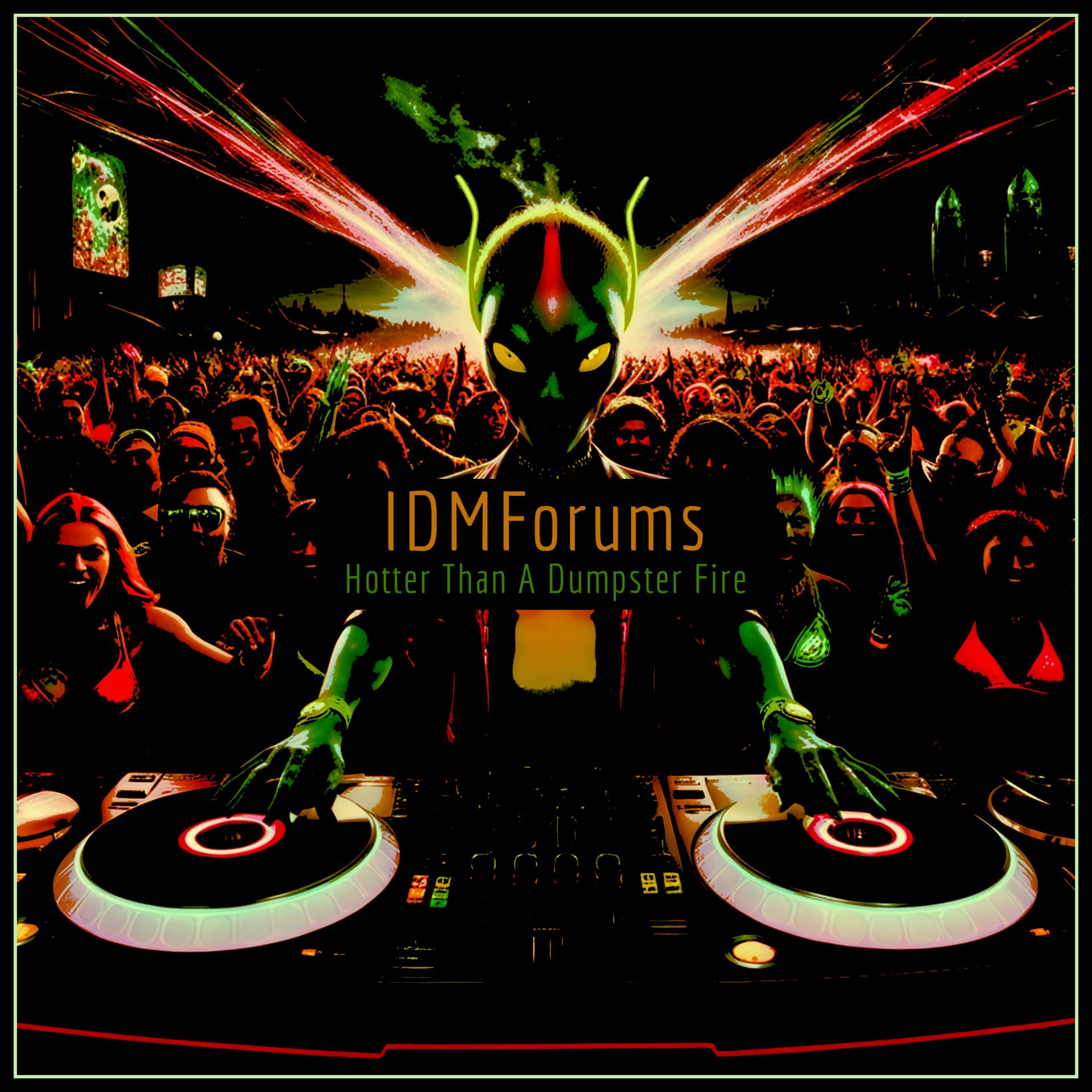
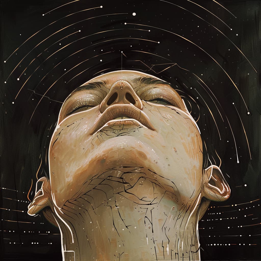
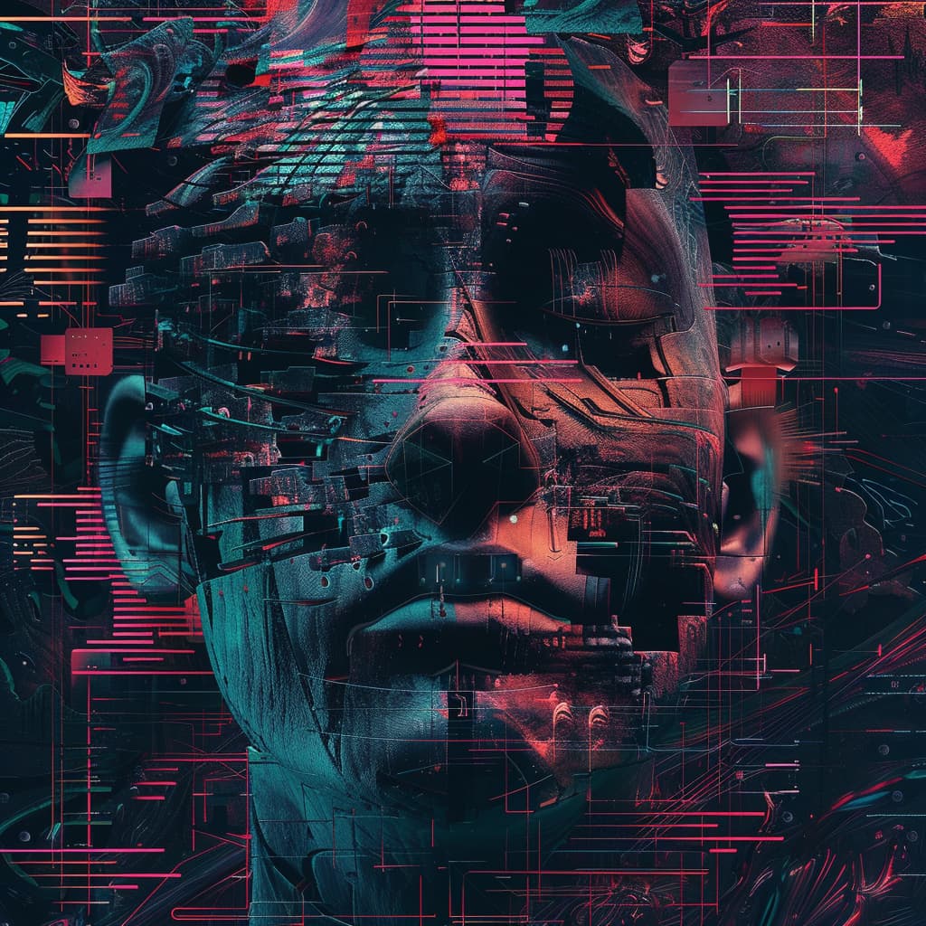
that last one with the face is awesome, but not quite as scalable/theme-able as I would like.
hmmm…
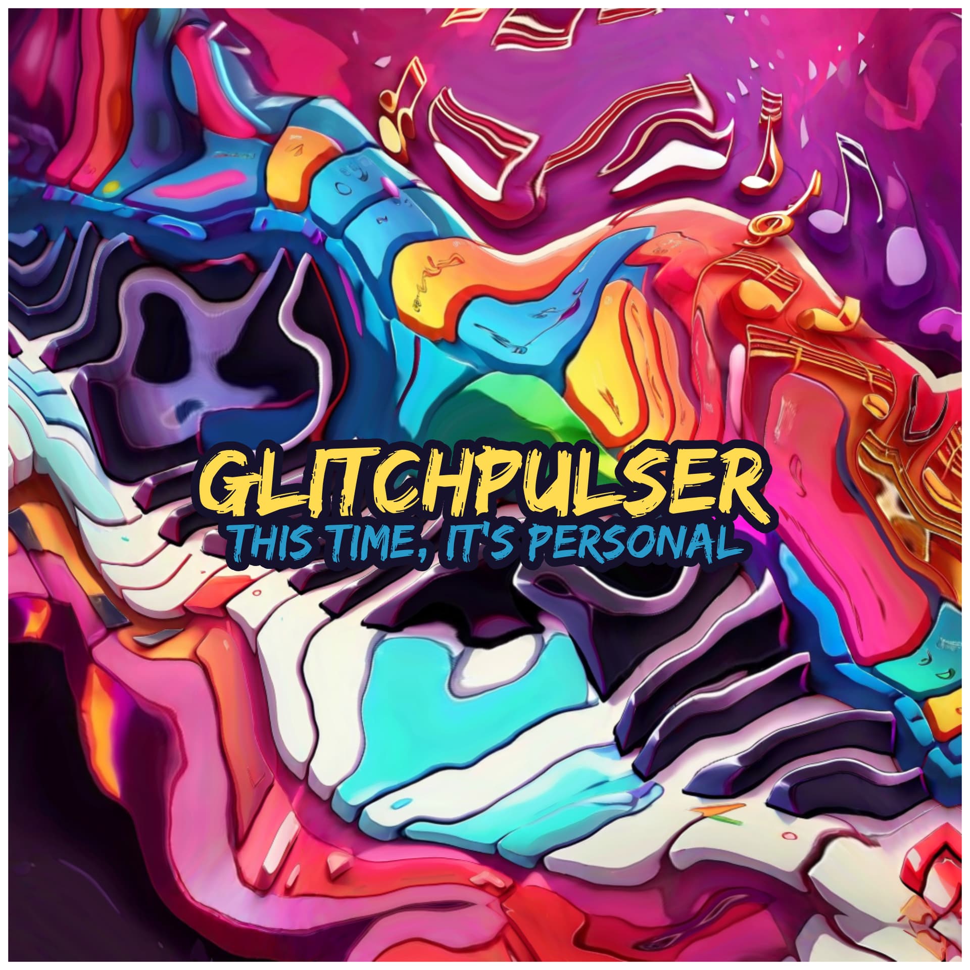
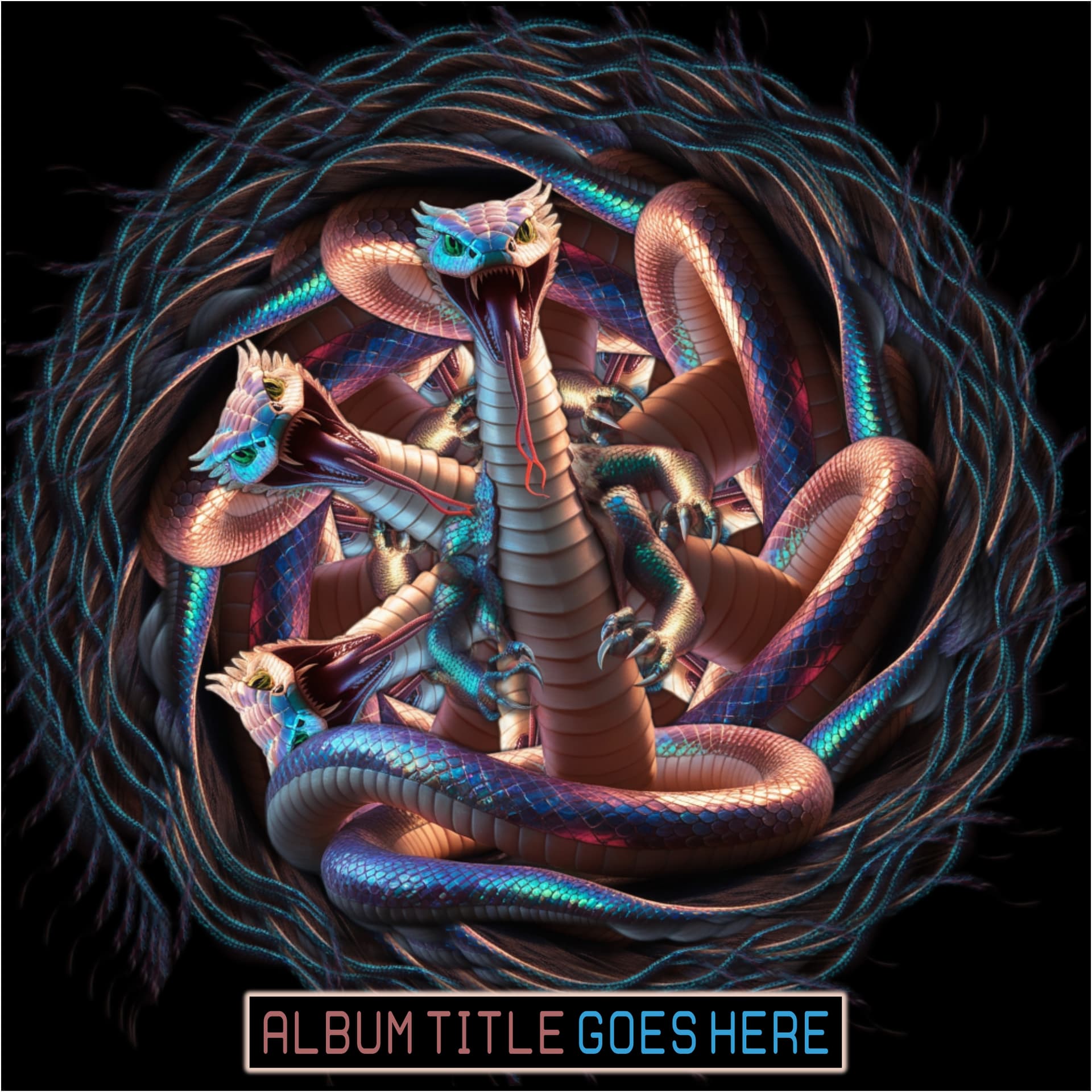
I’m quite fond on the color scheme of it. It ties into a lot of the past IDMf Comp artwork as well with it’s pink/purple shades. Perhaps that’s the theme…
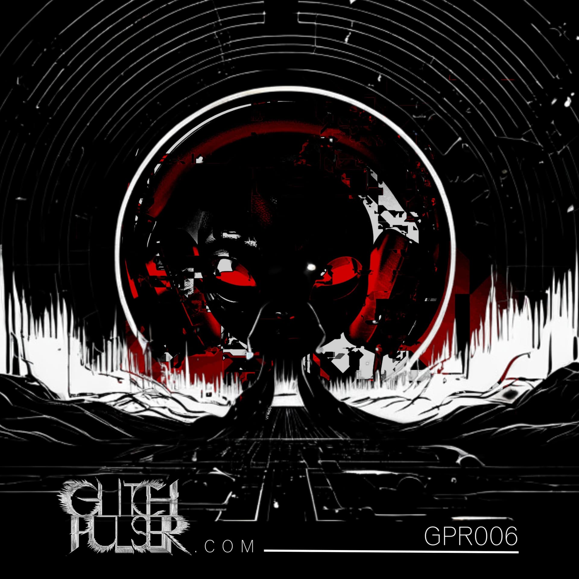
This one, i would love to be a part of. I can see some “Qebrus” coming in hard and unexpected. Lets do ET! And with all the UAP stuff nowadays, i think it will be suitable timeline snapshot in a audio spectral form of a release.
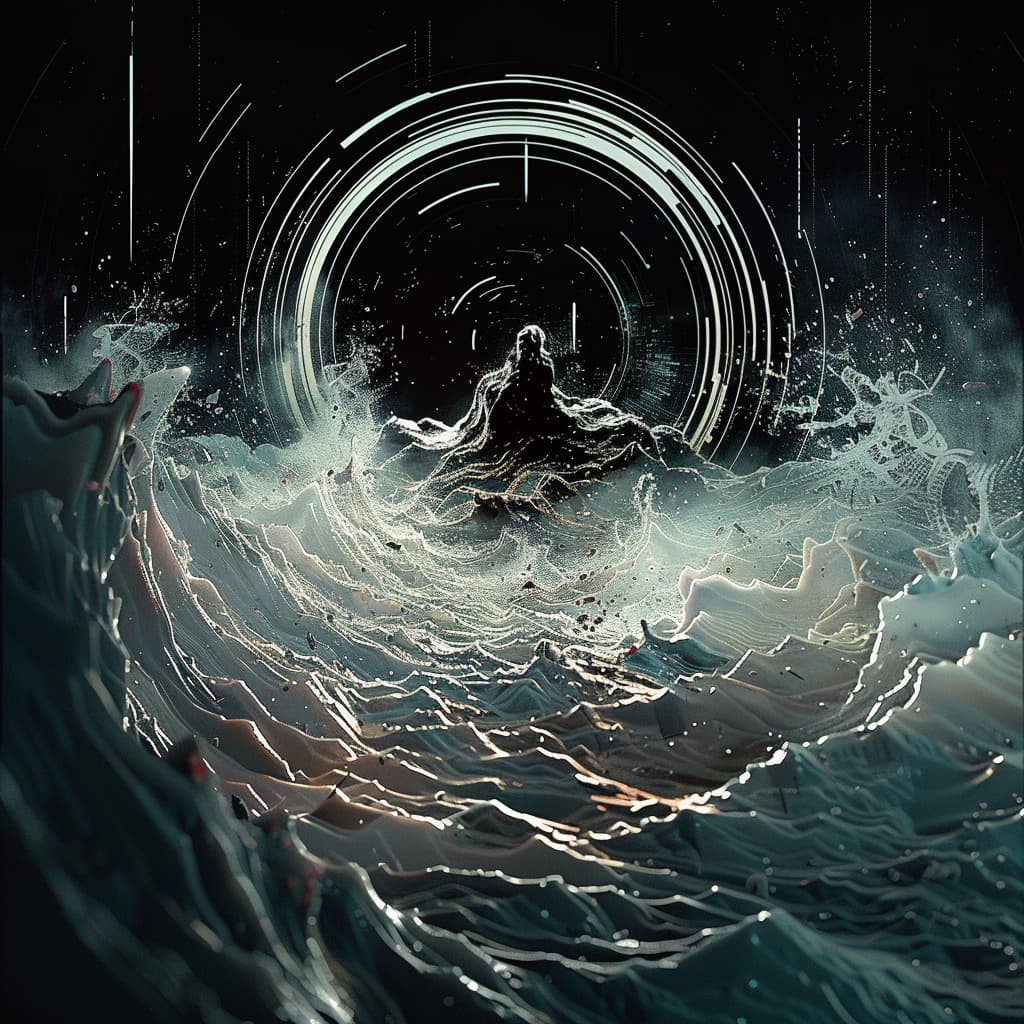
Ok well that’s something I can work with. I like the colors too, but definitely too busy. I’ll spend a little time working on a variation and I’ll keep the idea of text placement in mind (that’s commonly an afterthought for me)
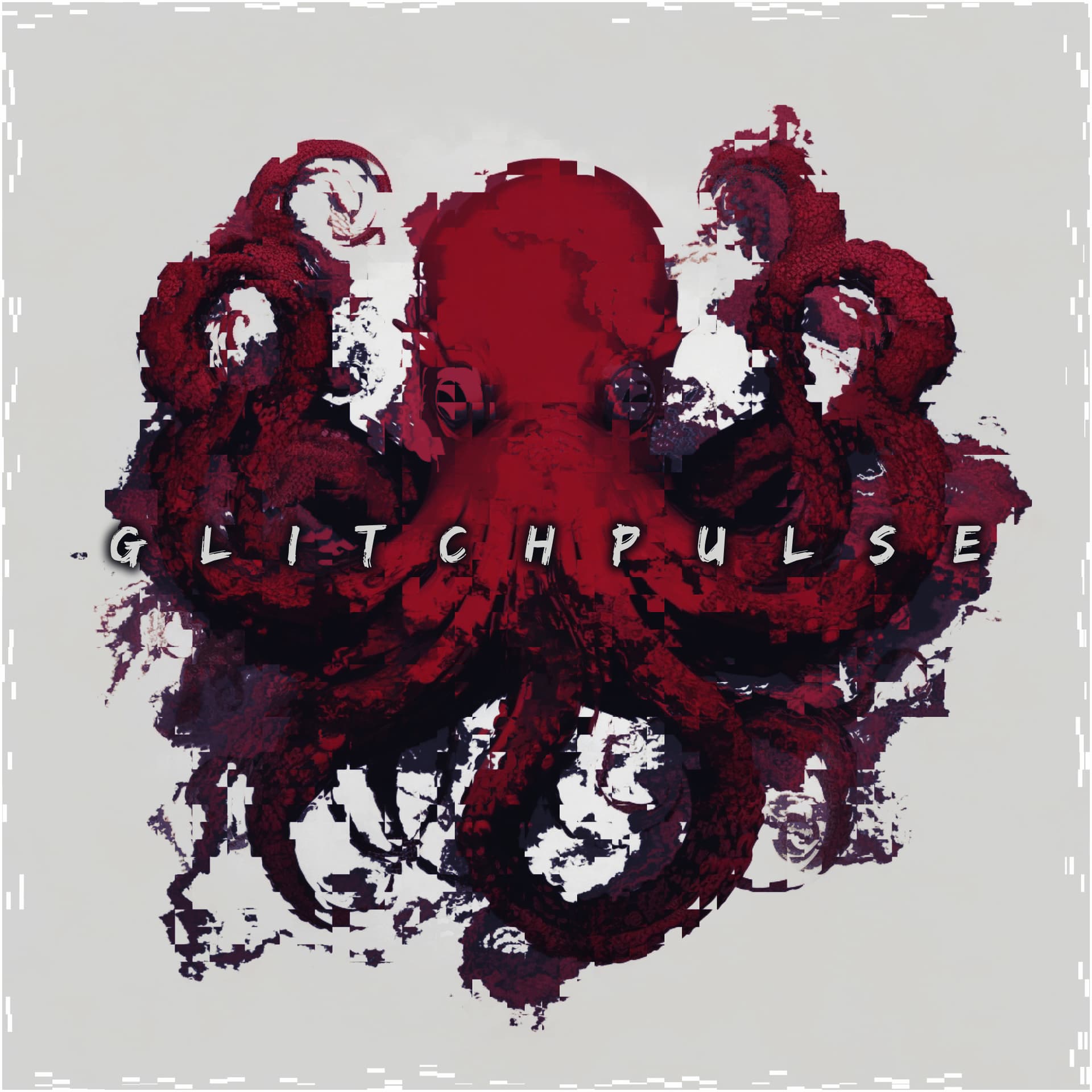
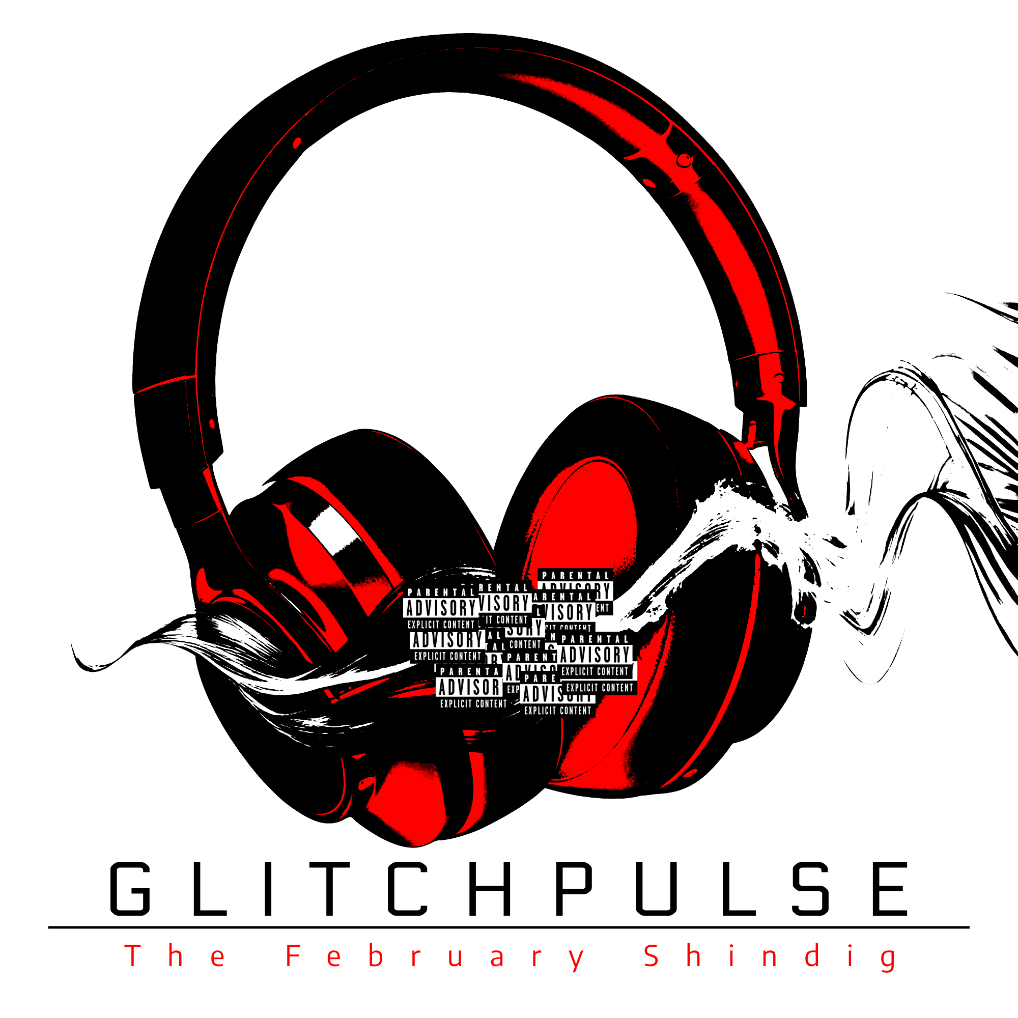
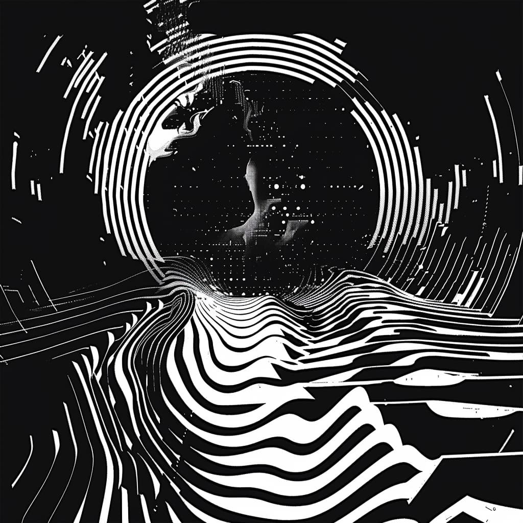
I also like these colors and the texture-by-glitchiness, but need something more relatable? as far as its shape goes.
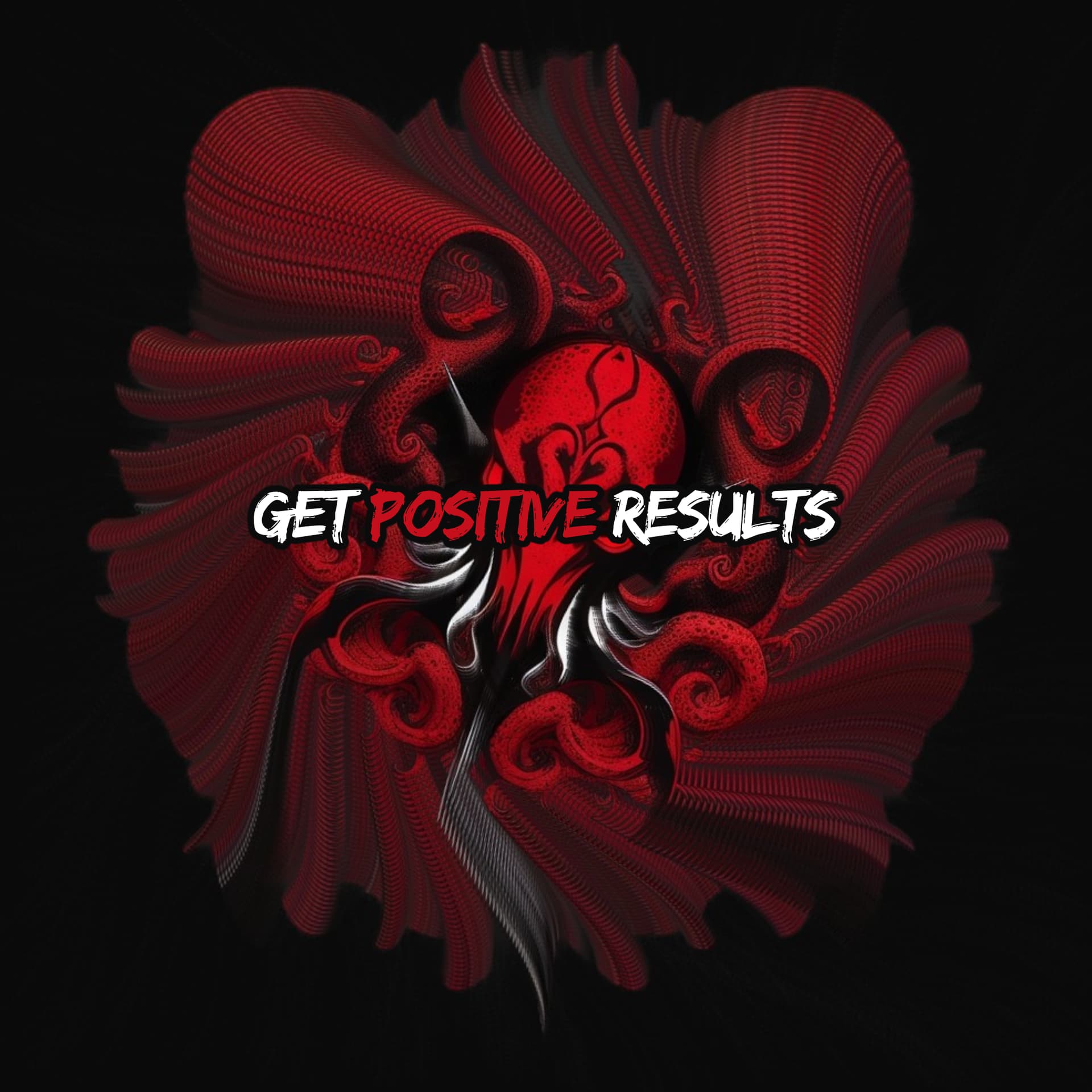
I will say that all the typefaces used so far are in this thread are a bit cringe for me, no offense (besides the GPR logo of course that one is pretty cool, but I don’t think that’s actually a font?)
This brings up another idea/project. Any other font-geeks out there? how cool would it be if GPR had its a selection of custom typefaces? this is something I’ll look into. a buddy of mine is getting one designed for his company, I’ll pick his brain on the subject.
Here are some of the fonts I’ve collected for various projects over the years… some of them are also cringeworthy lol