So I did some more analysis of the data set since I have it.
I was curious what the concentration of data looked like.
In a way, this concept is the statistics variation of LUFS. You’re basically asking what the “body” of the data actually looks like in much the same way that LUFS is measuring audio - same basic concept, but different math involved.
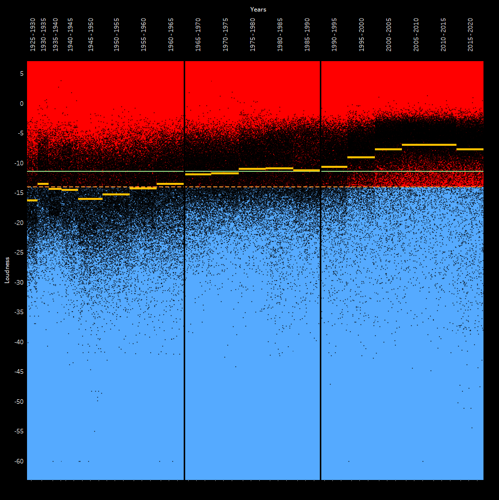
So I broke things into quartiles and looked at the upper quartile and lower quartile.
You can think of the upper quartile as the top of the meat and potatoes of a pile of data samples.
You can think of the lower quartile as the bottom of the meat and potatoes of a pile of data samples.
Then you take the median - that is, the middle ground between the two (not to be confused with mean/average).
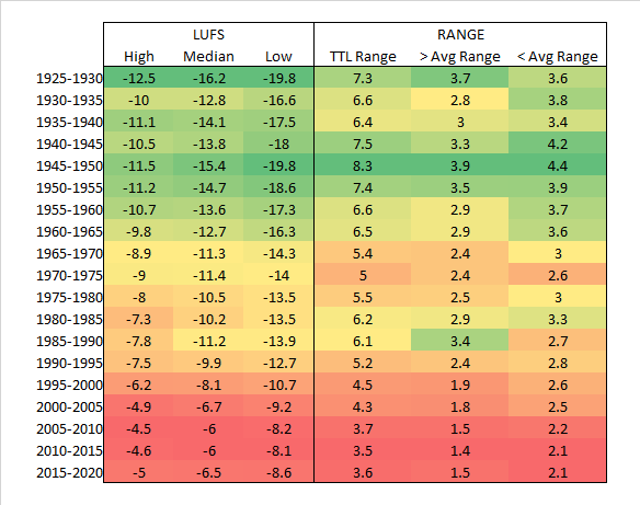
Next, to build the body and find out how concentrated the song’s LUFS are, you determine the range from the upper quartile to the lower quartile. So if your upper is -5 and your lower is -10, then your range is 5 LU.
The wider that spread is, the more freedom that a batch of music has (5 year period of time).
That is to say, the tighter this spread is, the more of a trend exists of following the average of that period of time.
What I find interesting is that as we’ve moved ever louder, we’ve also moved ever narrower on deviating from the average. By the time we get to the 2005-2015 era, it’s as loud as it’s ever been in history, and as narrow in diversity as it’s ever been in history. We’re currently still that narrow. The average simply dropped by roughly half a decibel - essentially returning to the early 2000’s values.
Here’s what it looks like when you look at this.
Keep in mind that this is not calculating anything to do with -14 LUFS. This is simply checking what the range is in a period of time relative to that period’s average LUFS.
So it’s really impressive not just how crunched everything is, but literally how crunched everything is.
In terms of loudness, there’s very little diversity.
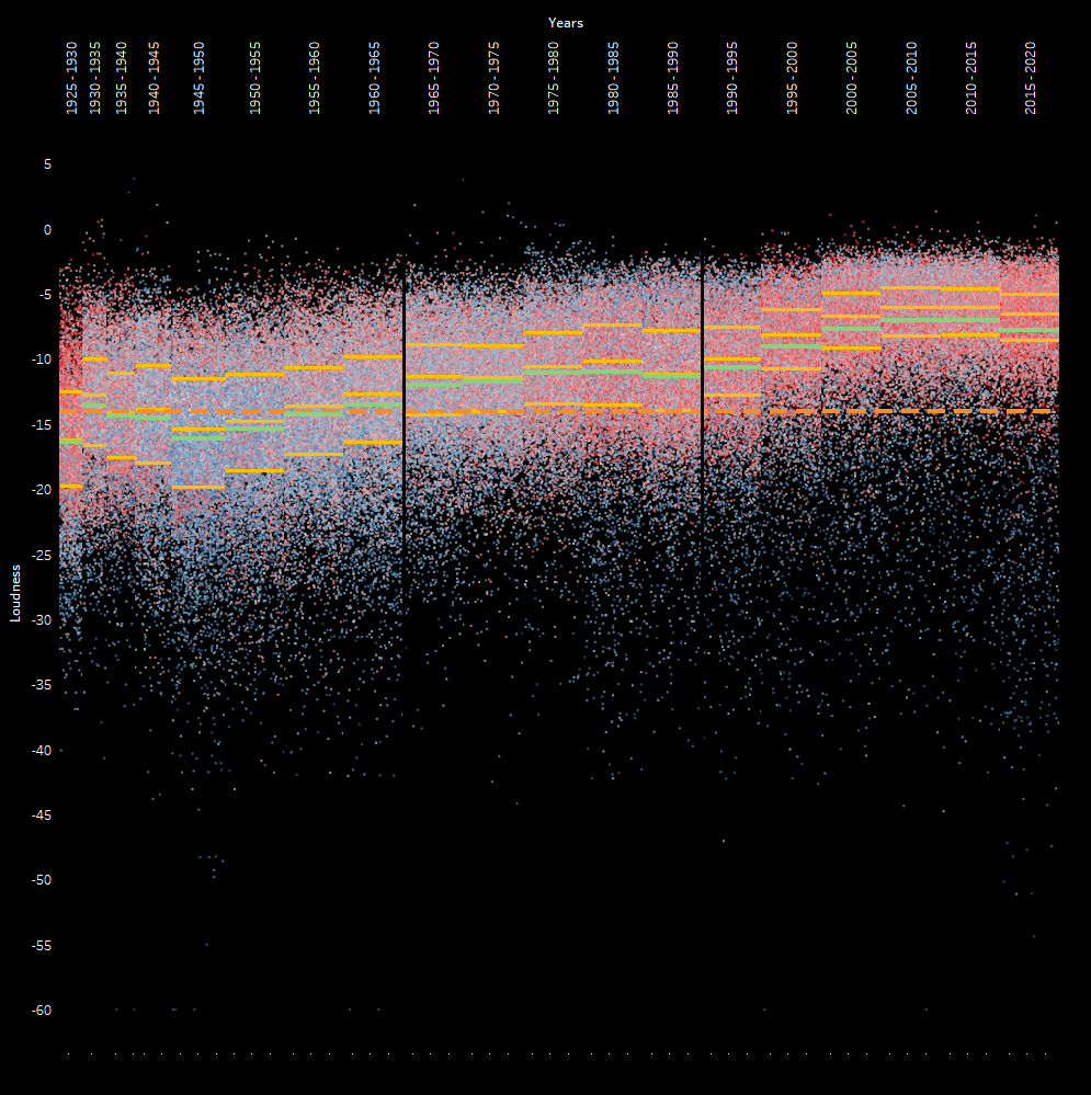
Also of note, the Spotify “danciness” metric was also provided, and coupled with this pattern is an overall increase in “dancy” music. Most of the music today is what I would call, active music rather than passive music. Conversely, most of the music in the 40’s and 50’s was passive.
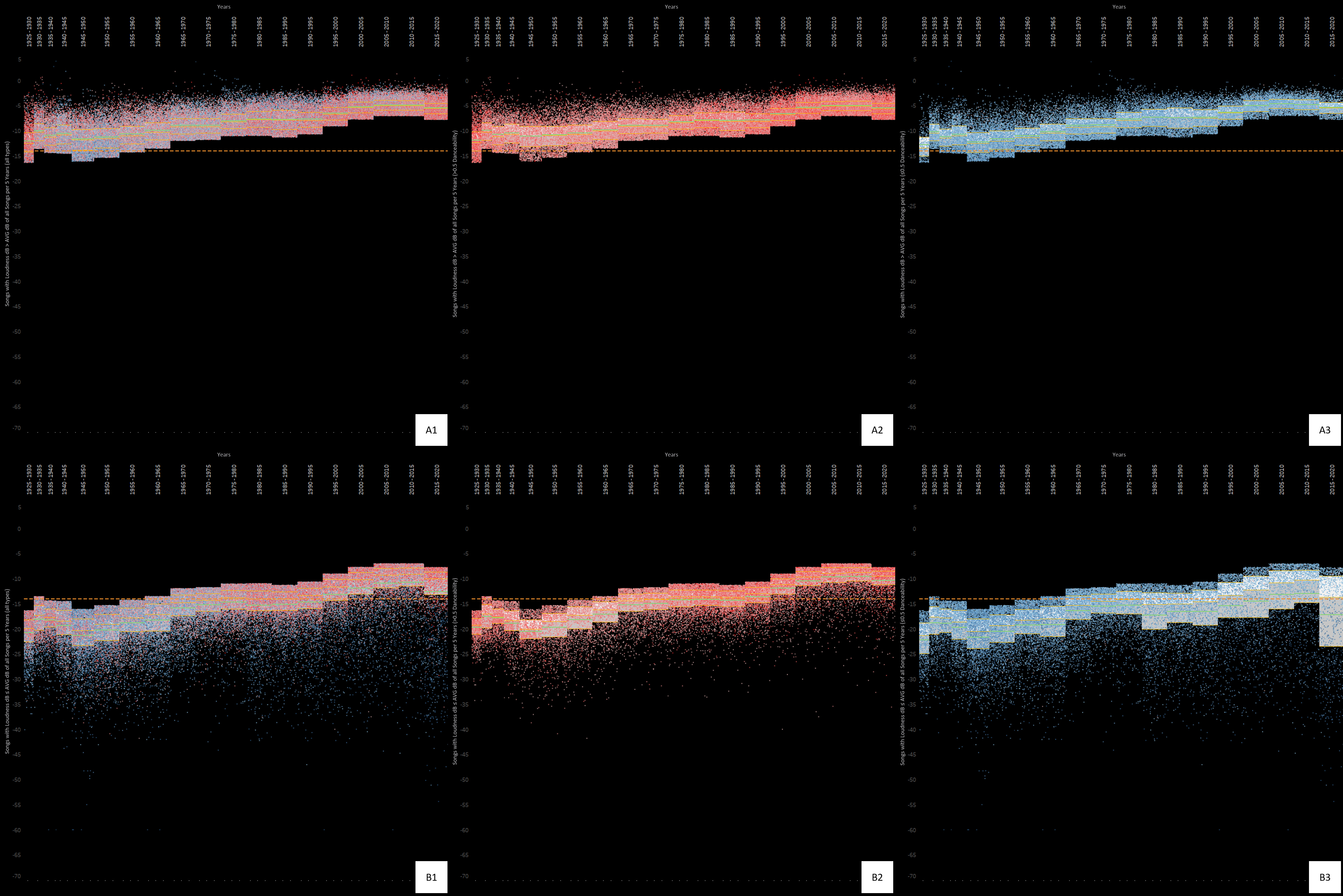
What I find really interesting is that the 20’s throw everything out the door. They have a huge range, are way below the -14 LUFS, and have a huge lean towards dancy music. We’re definitely much more refined and interested in a very uniformed audio experience now by comparison to then.
Also of interesting note. It’s approximately every 30 years (give or take 5 to 10 years) that we change course in audio preference culture in a strong direction regarding loudness…well…actually, overall in most properties.
The same can be found with danciness.
Here’s the updated charting showing all of this.
I removed the average of all data because things are already busy. So now the green line is the average of the period. The yellow lines are the Upper, Middle, and Lower boundaries of the quartiles.
Red dots = dancy
Blue dots = not very dancy
Cheers,
Jayson